
Article and photos by Kate Mahoney, as published in Creative Fibre magazine, September 2017.
This article is published with the kind permission of Kate Mahoney©
Woolcraft projects often consume many of our leisure hours and materials, and demand a high level of planning, and many of us see a pattern and fall in love with it, using available stash. We might spend a bit of time in planning, but aside from knowing that we have the right yarn and needles, and have the correct tension (gauge), most of the time we just think, ‘Wow, this is going to be great’. Often we are disappointed, particularly when combining many colours in a project. How much more disappointing is it when we dye the wool for a project and it’s not as we’ve envisaged? Enthusiasm is not enough when we’re starting something new. To avoid disappointment planning and sampling are needed, otherwise frogging (ripping back) or its equivalent won’t be far away.
Two major problems happen when selecting or dyeing wool for a project: colour incompatibility and tonal disharmony.
98 Shades of Mud
Most adults have a basic knowledge of the colour wheel. Imagine my surprise, then, when I discovered that there were two sets of primary colours – the ‘painter’s’ ones we were taught at school (red, blue and yellow) and the ‘printer’s primaries’ – cyan, yellow and magenta. The first set are also known as additive primaries and the second as subtractive primaries; whichever way you approach them, the primaries represent the total visible spectrum of light. The result of using additive colour mixes is usually slightly muddy, giving what my watercolourist mother used to refer to as ’98 shades of mud’.
For dyeing, I base my technique on the subtractive primaries as they give clear, bright mixes, and are easy to tip over into muted ‘designer’ colours by using an addition of a complementary colour. They can also easily be modified to give darker tones (values) with the addition of grey or black (pastel tones are achieved by dilution of the dye), and varying amounts of dye to determine the overall colour saturation.
In practical terms, using just three primary colours will probably not suit most dyers – that’s why several ranges of mixed shades are available. Using pre-mixed colours is enough for most craft dyers, and experimentation will soon show how well the different shades intermix. As well as the three subtractive primaries, I would recommend (for a start) black, dark brown and a clear green. Working with a restricted palette is a good way to find out how colours influence each other. As you become more proficient at mixing, you can add more reds, blues and yellows. Keep good notes so you can replicate your results.
There are a range of tools that can help to predict the outcome and the best of these are a painter’s colour wheel (available from art supply stores) and, particularly for project planning, the very useful Color Grid. Both give a good idea of how colours work together, and study of the colour wheel and/or grid in conjunction with test dyeing will lead to greater confidence in choosing and mixing colours, and more satisfying results in final projects.1
One last word about colour mixing: beware of optical colour mixing in projects – by this I mean the use of shades that strongly influence each other in the same project. One example of this is using direct complements (those colours that sit opposite each other on the colour wheel) in warp and weft in weaving, or in colourwork in knitting. The overall effect can be grey, flat and disappointing. There are many useful resources available on the topic of use of colour in woolcraft.2
Which Dyes?
I use the Teri range3 of hot acid (white vinegar) fixed dyes – this suits my taste, materials and methods. There are several other brands available – Landscape and Ashford are the most commonly available in New Zealand, while Jacquard is a very popular US brand available from some suppliers. If you prefer cold fix dyes, these are also stocked by many craft outlets. They do need additional chemistry for fixing. I don’t recommend Dylon dyes as suitable for wool as they contain dye for other fibres which just ends up down the drain, but if you’re excited to start and that’s all you can get, they do have a reasonable colour range.
Using Value
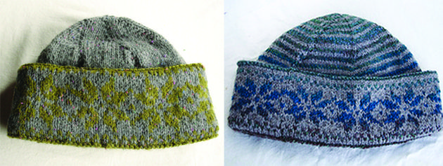
Value is a widely misunderstood term, and this misunderstanding is the source of many colour problems in multicolour projects. Simply stated, value is the depth of a tone, shade or tint of a colour – where it sits on the grey scale. Colours can be deceptive, and lack of appreciation of value will lead to problems with colour contrast, particularly in colourwork projects. For instance – I first used a grey and olive green commercial yarn to knit my Norwegian Stocking Cap. The result is somewhat underwhelming. Using a lighter background colour made an improvement.
I have come up with an easy way of assessing yarn suitability:
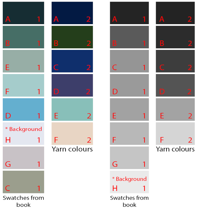
- First, I scanned each mini-skein of yarn (I could have also used a photo)
- Converted each colour into a small colour block via Photoshop
- Scanned the colour blocks that were listed in my pattern (you could also pick colours from a garment photo)
- Using the desaturate tool, removed all the colour from each set of blocks
- Rearranged the blocks in order on the grey scale
- Carefully labelled the blocks to keep track of the sets
- Finally, I was then able to compare the colour range of my yarns and the range used in the pattern. Obviously, they were very different, but after some thought I decided that I could still use my yarn for this pattern if I were to add some intermediate colours to the lighter tones, being very careful of the values, and selecting a very light background shade4
Notice how the contrast in the colours masks how close these colours are in value. C, D and E1 are very close in value indeed. I will have to spin another two colours to finish the set, choosing the tones and values carefully.
Overdyeing Natural Coloured Wool Bases
All of the above applies to dyeing coloured fleece, but the underlying colour has a significant effect on the results. This makes overdyeing natural fleece both challenging and rewarding.
Most coloured fleece has a brown underlying colour – even light grey fleece can contain a significant amount of brown (except in the case of sheep which carry the blue colour gene, typically steel grey fleece). Using colour theory to explore the underlying colour, it can be seen that brown = red + green (blue + yellow) – in other words, all the primaries are present, so there will be a progressive muting of the dyed colours as the fleece gets darker, both because of the darker tonal value and the natural colouration of the fleece. For this reason, even a light grey containing brown will subtly affect the dyeing result. ‘Moorit’ or natural brown fleece leans towards yellow/red, so this must be taken into account when overdyeing, otherwise you may be in for an unpleasant surprise.
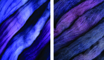
When I was planning my Back Country range of colours dyed over Haunui® Handcraft Wools NZ Halfbred, I deliberately chose colours to complement the underlying tones of the fleece – red/browns and mossy greens for moorit and oatmeal shades and clearer yellows and blues for the light and dark greys. I wanted to acknowledge the beauty of the natural colours, so left a large part of the fleece undyed in these shades. Using the natural tones and complementing them with suitable colours means many of these colourways can be used together harmoniously.
My colour mixes when dyed over both Merino and Haunui® NZ Halfbred are dramatically different depending on the underlying colours, to the point where they are not recognisable as the same colour mix.5
All these possibilities make overdyeing coloured fleece a very satisfying thing to do – sometimes the colours are not quite what was planned, but these are nearly all pleasant surprises. The unpleasant ones can be further modified into batts, so if at first you don’t succeed …
1 The Grumbacher Color Compass is now out of print but there are some used ones available on Amazon.com. Grumbacher now make a similar Color Computer tool (available on Amazon.com).
2 Menz, Deb. Color Magic – Value & Harmony. Interweave Press, 2014. (Video) https://www.interweave.com/store/color-magic-value-and-harmony-grouped
Menz, Deb. Color Magic – Color Families. Interweave Press, 2014. (Video) https://www.interweave.com/store/color-magic-color-families-grouped
Menz, Deb, and Garrett Evans. Color and Yarn Design for Spinners: Inspiration and Know-How for Creating Yarns That Sing. Loveland, CO: Interweave Press, 2011.
Bryant, Laura M. A Knitter’s Guide to Color. United States?: Interweave, 2011. (Video) https://www.interweave.com/store/a-knitters-guide-to-color-with-laura-bryant-download
Callahan, Gail. Hand Dyeing Yarn and Fleece: Dip-dyeing, Hand-Painting, Tie-Dyeing, and Other Creative Techniques. North Adams, Mass: Storey, 2010.
3 www.teri-dyes.co.nz
4 Colour swatches are for the Blue Shimmer pattern in Wendy Keele’s Poems of Color; Knitting in the Bohus Tradition, Interweave Press, Colorado, 1995
5 Fibre from Heavenly Wools: www.heavenlywools.co.nz